
This week I’m knitting with a fuzzy yarn from Universal Yarn called Revolutions. It’s a bulky weight yarn that consists of 4 or 5 colors that transition or fade from one into the other. Yesterday, we looked at its fiber composition. Today, I’d like to show you each wheel of Revolutions close up.

Let the Grapes Attack! This brilliantly rich colorway of Revolution works regal elegance into every stitch.
The swatches and shawl that I’ve been knitting out of Revolutions is in the Grape Attack colorway. This rich series of purples transitions from a light lavender, which reminds me of the bloom on grapes. The bloom is that white waxy coating that the grape plant produces on the grapes’ skin to retain moisture. The next purple reminds me of grape jelly in all its shiny sweetness. The third color has the hue of a mulled wine, spicy, deep, and dry. And the final color is deep, almost black shade of purple and it reminds me of a glass of juice made with Concord grapes. This monochromatic colorway will make lovers of purple very happy.
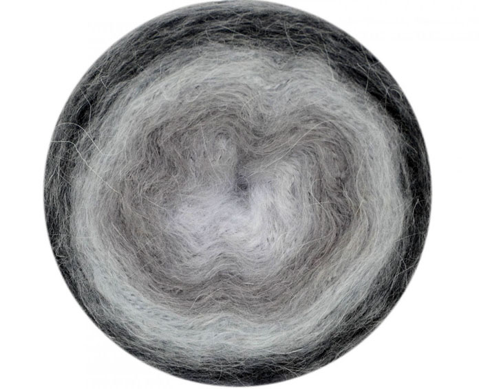
Sedate, urban grays and icy whites blend together seamlessly in the Storm’s Coming colorway.
There are two other monochromatic colorways. Storm’s Coming takes the yarn from an icy white, like the top of a winter cloud in the sun, through various cool gray tones, to a deep charcoal — like the underside of that same winter cloud that’s about to drop its weight in snow.

For turquoise lovers, this colorway brings the best of gemstones and Caribbean beaches into one yarn.
If you’ve ever sat on the shore of the Caribbean, you’ll have seen all the tones of the other monochromatic colorway, Marina. For knitters who lean towards those jewel teals and rich aqua-blues, this colorway is perfect. Wear this knit-up in a shawl and you’ll bring the warm, green-blues of the beach right around your neck.

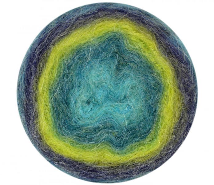
Take some 60s funky colors, shift their intensity to the 80s jewel tones, smooth them into the new millennium, and you’ve got yourself some Restless.
The next wheel of Revolutions that you can see above is Restless. I’m not sure why the color designer(s) chose this name for this yarn, but I’ll tell you what it reminds me of. In my mind’s eye, I see a dress my mom used to wear in the 60s and early 70s that had a paisley motif and colors that were introduced into fashion in that era from batik cloth imported from India. Anything psychedelic like that would be sure to keep me restless and make it hard to focus. But this fun colorway that transitions from lime to hot pink to denim blue to violet will knit up very attractively, and attract a lot of attention.
Inspired by nature and a scenic view, Grassy Knoll captures the colors of a warm summer day in a meadow at the foot of some majestic mountains.
You may be familiar with the classic painting Water Lilies by Claude Monet. The wheel of Revolutions called Hidden Pool reminds me of it and Monet’s Japanese Bridge, which captures similar hues. Hidden Pool even has a dark shade of purple that can be found in the shadows of that bridge on the water’s surface. If your pastoral French dreams were ever to come true in the form of yarn, this would be it.
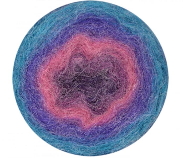
The chic and romantic French country colors of Revolutions’ Hidden Pool colorway will add a zing of color to a somber winter day.
In Harmony, the color designer introduces a light blush peach amidst calming grays that have a hint of a bluish jade. If the notes and vocals of a 4-part choir could be seen, they would look like this yarn.
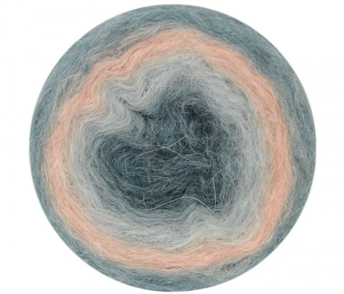
The subtle pastel hues in this colorway of Revolutions are soft and romantic.
The last colorway, and my favorite is Port. Family and friends will know that it’s also my favorite digestif, but that is neither here nor there. The cake, or yarn wheel of Port begins on the outside edge with a rusty cinnamon color, to a chalky umber, then on to a rich port red, ending with charcoal gray. It’s sweet and soothing, charming and subtle, just like its namesake. Okay, back to yarn…I would love to design a man’s buttoned vest with this colorway.
What would you knit with it?

The autumnal hues of the Port colorway of Revolutions is the perfect yarn to complement a wardrobe full of earth tones.
So after looking at each of these colorways, which combination of fading or transitioning colors appeals to you?
This is part 2 of 5 in this series.
Go back to part 1: Revolutions: A trendy gradient yarn meets luxurious winter coziness
Go to part 3: 4 tips for knitting with fuzzy yarn
[shareaholic app=”follow_buttons” id=”23784471″]