
As I typed the title for this post, for some strange reason I was reminded of the theme for the Laverne & Shirley show, a sitcom that ran from 1976 to 1983.
Anyone who knows me knows that I love color…sorry beige! Bonus for me, the yarns I was sent to review this week has lots of ’em! Deluxe DK Superwash has a range of 63 colors, and Deluxe Worsted Superwash has 72! And that doesn’t include the complementary shades of tweed yarn!
This link to the Deluxe DK Superwash color chart will get you started. From there, you can start dreaming of the colors for your next project, and you can search around for the Deluxe DK Tweed and all the Deluxe Worsted Superwash yarns, too.
In yesterday’s post, I put up a .pdf file for the Argyle Junior Vest. I chose this pattern for a reason.
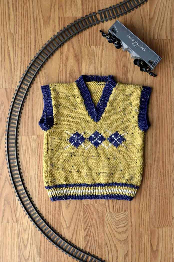
This child’s vest is shown in one colorway, but what if we did it in other colorways? Can we dress it up? Can we shake it down? Can we feminize it? Can we perk it up?
So why do I get so cranked up about all these colors? A lot of it has to do with the fact that yarn shop owners often tell me that they sell out of the colors of yarn used to make their display samples or the colors pictured in the pattern photo. There could be a perfectly wonderful blue on the shelf, but if that sample is made with purple, the purple yarn will go first! Isn’t that sad?
It seems that the primary reason for this is that people seem to think the designer chose that color because it works best with the pattern. Other reasons could be a lack of color confidence on the part of the knitter, color trends in fashion, and gender stereotypes.
I chose this vest pattern because I saw many options for changing up the 3 colors in it, plus, it’s a fast knit, and it has just enough challenge in it that an adventurous beginner can tackle it. The pattern comes in 6 sizes, to fit ages 6 months to 10 years, so the possibilities are almost endless. You can
- do it pastel colors for an infant
- do it in primary brights
- choose Halloween colors
- choose Christmas colors
- pick grown-up colors for the first day of school or school photo day
- make it in patriotic colors
- make it to complement a fall vest or winter coat or blue jeans or a skirt
There are a lot more ideas floating around in my head, but I think you get the idea!

The values of these three colors are too close to make the vest, but any two of them could be combined with a cream or ivory main color for the Argyle Junior Vest – if you’re bold enough dress a child in a predominantly cream garment! And, wouldn’t they look great in an adult sweater?
I love everything about color: color theory, the psychology of color, the colors in nature, and even the variety of shades, and tones within each hue. I love that there are cool colors (blues, purples and greens) and warm colors (reds, yellows, and oranges) and that we can combine them to set a mood for our homes and our wardrobes.
The color theory includes the color wheel, color values, and even the elements I just mentioned: hue, shades and tones.

I created this color wheel for the color theory workshop I offer.
Color values are the depth a color has when it’s converted to black-and-white. It relates to hues, shades, and tones. A hue (red for example) is the purest form of a color. Pink is a tone, or lightened red and burgundy is a shade, or darkened red. Pink has a higher value than red, and burgundy has a lower value. If you compare them in black-and-white, pink still has a higher value than red or burgundy.
When you look at yellow the same holds true: a buttercream yellow will still have a higher value than its hue, and a golden yellow will have a lower value.
But, when you compare the two ranges of reds and yellows, you’ll see that both pink and red have a lower value than gold.

On the left are pink, red and burgundy squares with their gray scale values underneath each. On the right are butter, yellow, and gold squares with their gray scale values beneath them. This graphic shows that the lightest of the reds actually has a lower value than any of the yellows.
Most multi-colored garments, whether they are done in intarsia, stripes, or color-stranded knitting, will benefit from a mixture of both hues and values. Often, higher value colors make effective accents, because they make a pattern pop. Colors with lower values have the usual effect of anchoring or grounding a project.
I could go on and on about color – I haven’t even touched on colorways, or neutrals – but it’s time to move along.
Now that I’ve armed you with all this excitement for color, I hope you’ll expand your horizons and choose a unique set of Deluxe DK and Deluxe Worsted Superwash yarns to create your Argyle Junior Vest. Here’s a colorway to egg you on:

I ‘girlied up’ the Argyle Junior Vest with this primary-based colorway. The primary colors (red, blue and yellow) have long been my favorite, and as is the case here, they creep into many of my projects. Note how I shook things up by changing the values, adding a deep navy blue for the diamonds to offset the higher-valued pink and yellow.